At the end of a week and at the end of every month, I cycle through various charts of assets and relationships that I am monitoring. I believe it’s invaluable to assess trends over various time frames, regardless of your own investing time horizon. I was taught to “zoom out” and take the longer view as the first step in the process, then utilize shorter time frames step-by-step.
Here are some charts from this week that stood out to me.
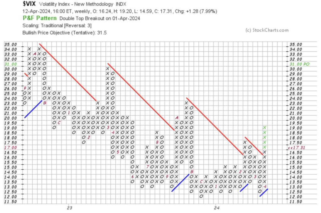
1. VIX Volatility Index ($VIX)
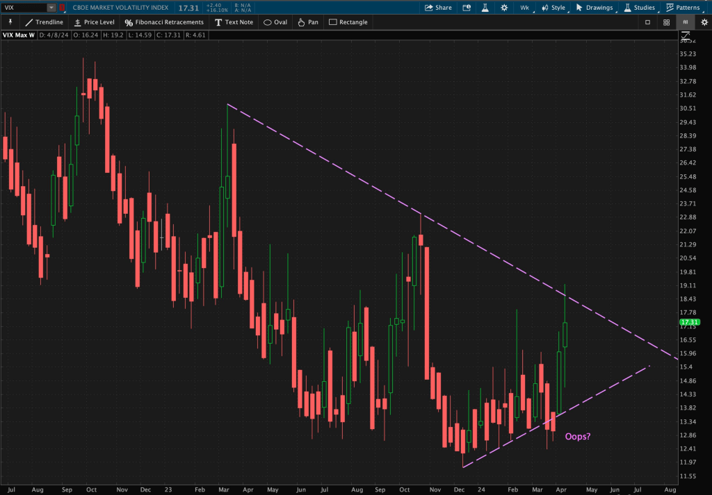
The VIX broke out of its valid descending trendline resistance level of its weekly Triangle pattern, following an “Oops” pattern – a failed breakout of the opposite side of the pattern – from three weeks ago.
Removing the essence of time from the equation, using Point and Figure (P&F) charts, you can see with the resistance break, we have a new price objective of 31. There is no time frame at which this can or will be reached in the VIX. P&F charts are time independent.
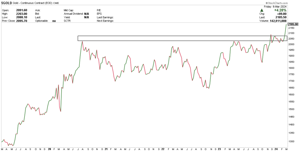
2. Gold
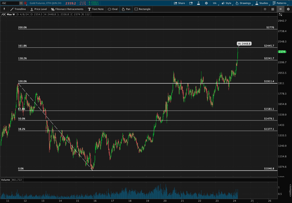
I drew Fibonacci Retracement levels from 2011 highs to 2015 lows. You can see as of this week’s price action, Gold finally reached to its 161.8% Fib resistance level. There’s still room to run here.
The next Fib level, the 200% resistance zone is around $2776.
3. US Dollar Index ($DXY)
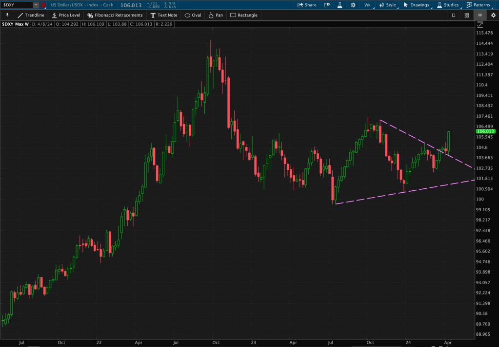
The Dollar has scored four consecutive weekly closes above its descending trendline resistance level of its Triangle pattern breakout.
This week, it also closed above an important horizontal resistance level. If it begins to work its way up towards 106.60, it may put pressure on US equity markets.
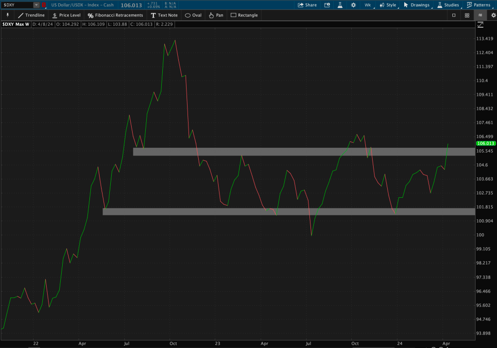
The Dollar and US stocks have been negatively correlated for the last few years.
4. 10-Year Treasury Index ($TNX)
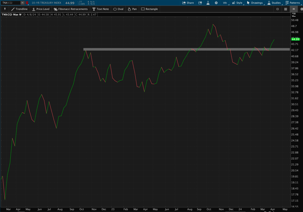
This is the second consecutive week that TNX has notched a weekly close above long-term resistance – which takes place around 2022 highs.
5. Oil
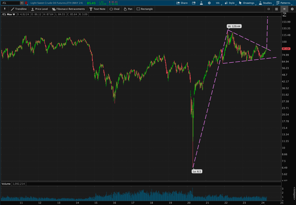
Oil is on the cusp of its valid descending trendline resistance level, which coincides with a possible Pennant pattern.
I’ve outlined Oil’s long-term target price from the “possible” pattern if it does end up breaking out of this resistance level: https://dash-charts.com/2024/04/09/commodities-time-to-shine/
6. 20-Year Bonds ($TLT)
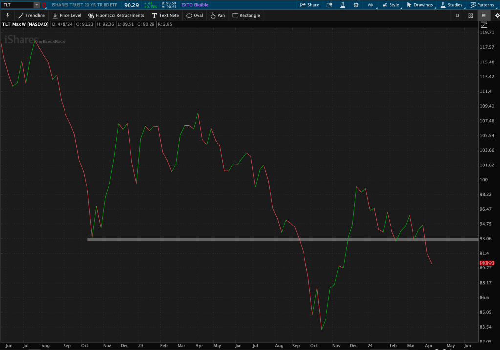
That marks two weeks of consecutive closes below long-term support, from 2022 lows, for Bonds.
Zooming out a bit more, you can see bond prices are near their 2011 lows – a long-term support zone.
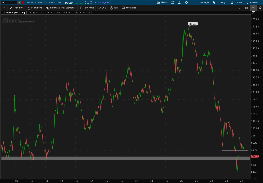
Hmmm bond prices continue to fall and rates continue to rise….
7. Consumer Discretionary ($XLY) vs Consumer Staples ($XLP)
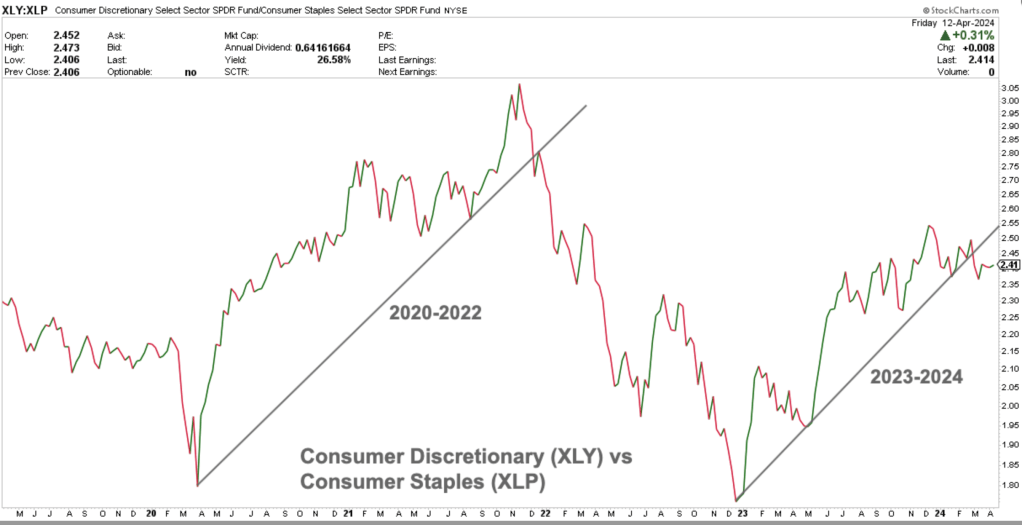
This is one of my favorite relative strength relationships to monitor for risk-on vs risk-off relationships. You can see the parallels between the valid descending trendline support in the last cycle compared to this current one.
This relationship has now notched six consecutive weeks below this previous trendline support (now new resistance). Staples, the risk-off or defensive sector, has been outperforming Discretionary, the risk-on or cyclical sector, over this time span.
Now these last two charts are not “weekly” charts (using weekly candles or closes), but have become part of my weekly routine.
8. S&P 500 Market Breadth ($SPX)

The percentage of stocks above their 50 and 200-day simple moving averages (DMA) have been a simple yet popular measure of market breadth or participation. You can see that as of two weeks ago, the percentage of stocks above their 200 DMA (purple line) has broken out of its long-term resistance zone – which is typically when 75% of stocks are above their 200 DMA – and then quickly retreated, forming yet another “Oops” pattern.
This seems to be a theme.
The percentage of stocks above their 50 DMA (blue line) never reached its resistance level of around 90%. It also experienced a swift drop this week.
In addition, NYSE stocks making new highs versus NYSE stocks making new lows has been another market breadth indicator. This week, less stocks made new highs, and more made new lows.
Think of this similar to a ratio or relative strength chart.
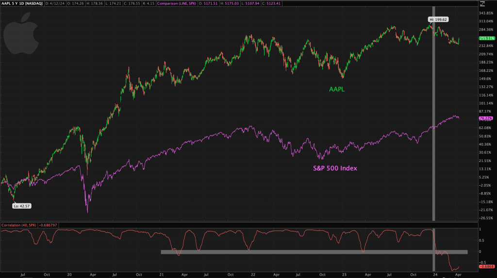
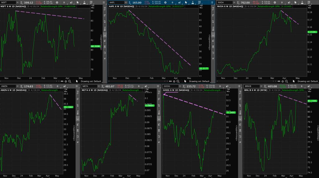
9. Apple ($AAPL) & SPX correlations
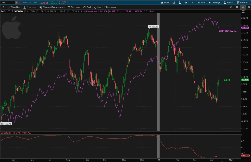
Since the start of 2024, the 40-day correlation (roughly two months) between Apple and SPX has changed – they are now negatively correlated (red line below the chart).
Zooming out to a 5-year timeframe, you can see at times they have become uncorrelated, but this negative correlation is a new theme.
Something has changed in this relationship since the start of the year.
Is Apple, our multi-year market leader, becoming the flight to safety after its phase of dethronement by Microsoft?
What is going on here?
It’s safe to say that interesting things are happening in the market. Using various time frames spanning various market relationships will continue to give us clues as to what is to come and how to react.
Remember: the goal of technical analysis is not to predict price action, but rather knowing how to react to it.


Leave a comment