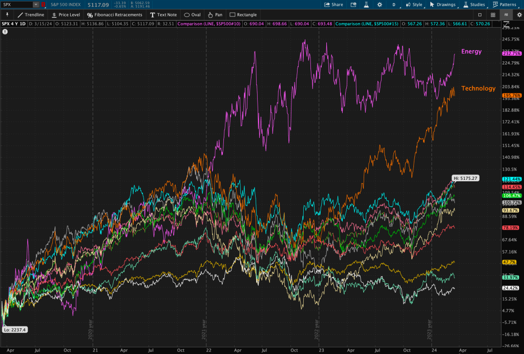
Over the last 4 years – since the 2020 lows – the Energy sector has been the outperformer, and by a wide margin. The S&P 500 Energy sector has a whopping 233% return since March of 2020, and the closest behind is the S&P 500 Technology at a near 196% return.
Now that’s quite a difference.
Why?
Since 2020, we have been in an inflationary, rate-hiking cycle. It’s no surprise that Energy is the best performer.
Energy and commodity prices lead energy stock prices, and those stock prices are typically a leading indicator for interest rates. Thus, energy prices and commodity prices are strongly positively correlated with rates. The story is as old as time.
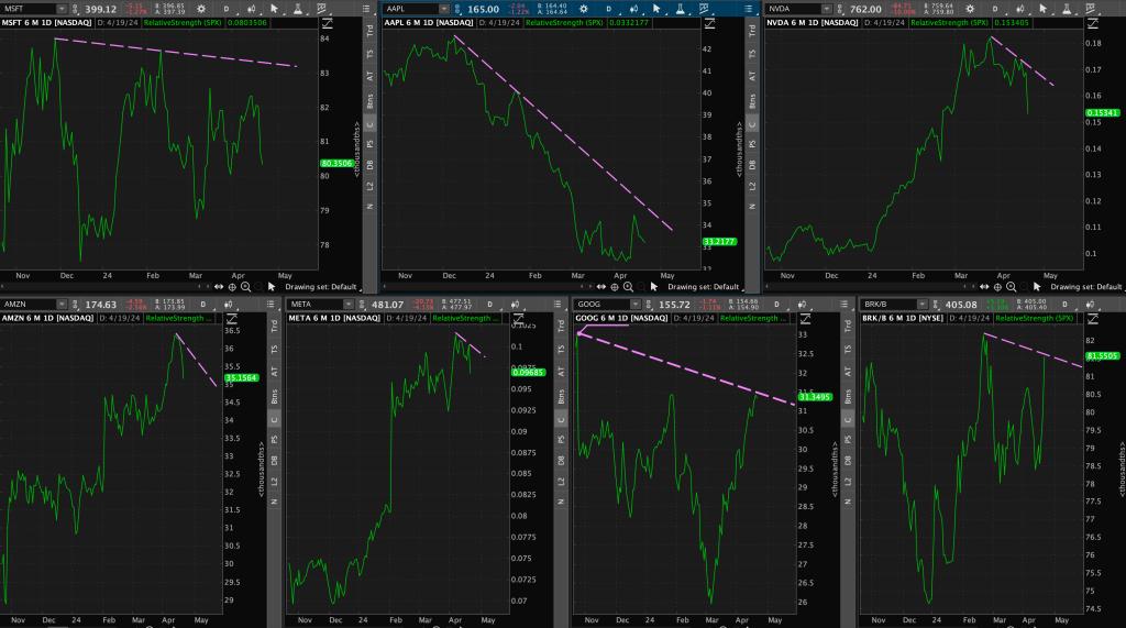
I am sure by now you’ve seen my Energy, Bonds, Rates, and Technology charts ALL over “X” and Instagram over the last few months. I have been keeping a close eye to the polarity zone that has been transpiring between all 4 groups.
It’s no coincidence that this week in particular seemed to signal a near-upcoming shift in short-term leadership and market regime.
So what happened this week?
First, Technology (NASDAQ Composite) is back underneath its weekly close 2021 highs after its breakout last week, where it notched its highest weekly close in history at 16,275.
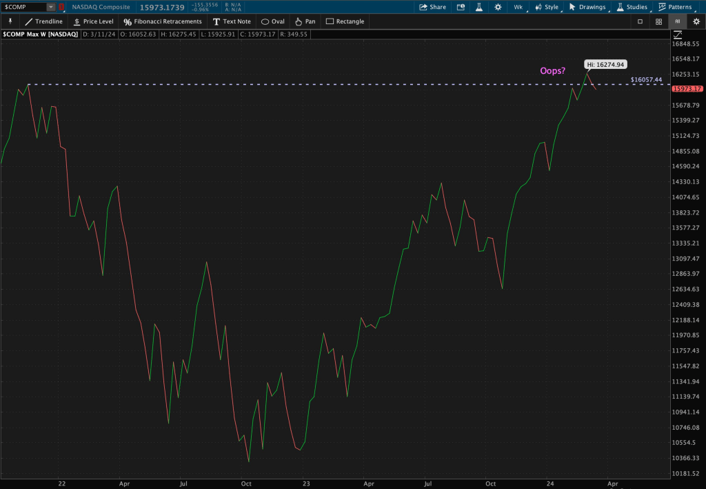
This level at its 2021 highs was resistance for 2+ years before last week’s breakout, when it became new support. Well now that it’s broken through this “new support” once again, this level becomes its new resistance.
It looks like an “Oops” pattern (false breakout) to me so far….
Now, looking at the Nasdaq in a bit of a different lens, using Elliot Wave Theory, we have seen the technology sector form “waves” or patterns within its ongoing trend. In October, I drew Fibonacci Retracement levels from January 2023 swing highs to bear market 2022 lows and shared this chart of the Nasdaq using Elliot Wave technique.
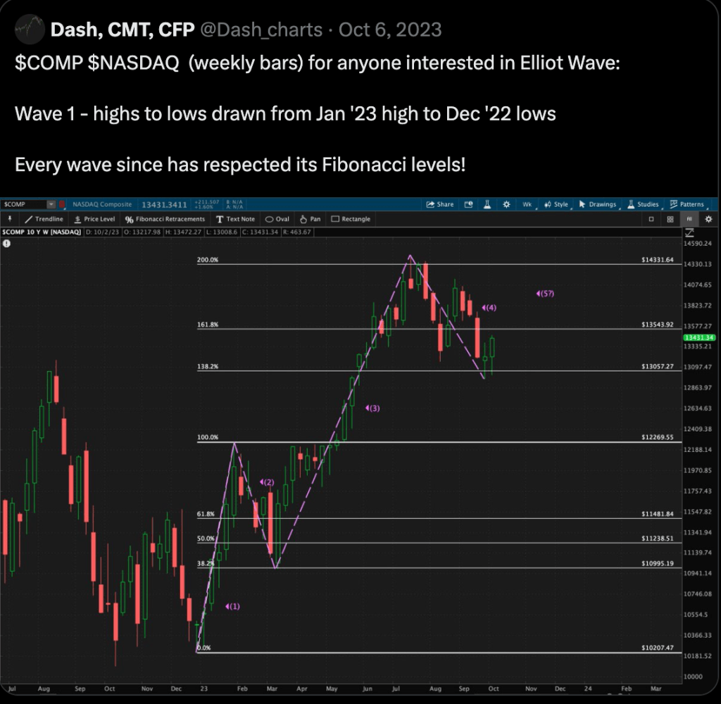
Since then, the Nasdaq has continued to March higher, until last week when it seemed to stall out at its 300% Fibonacci Retracement level.

Does it get more perfectly measured than that? This is why I love technical analysis.
It seems as though its motive wave with a 5th wave extension halted at that level. With wave 5 extensions come sharp counter-trend reactions, or corrective waves, to the previously established motive wave.
What is causing the Technology sector to possibly peak here?
Let’s use intermarket analysis to find out.
Bonds
Using $TLT (20-year bond ETF) as a proxy for the Bond market – you can see that this week, Bonds experienced a resistance bounce off of their valid descending trendline resistance level before quickly moving back towards horizontal trendline support.
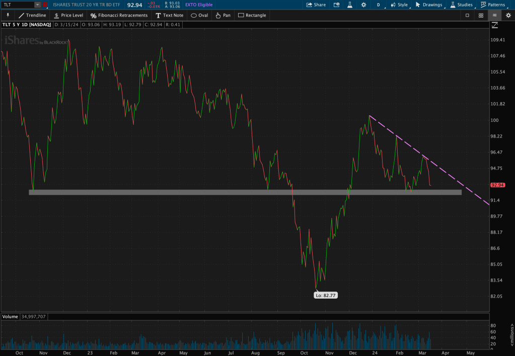
Bond prices and yields are negatively correlated, and move in opposite directions. So if bonds are falling, are interest rates going up?
Maybe!
Speaking of interest rates, let’s look at what the 10-year Treasury Index, $TNX, did this week.
Rates
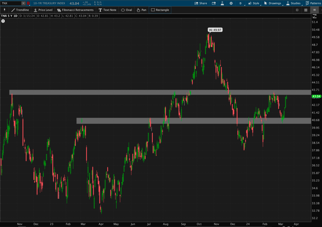
The Treasury Index also made some fast-paced moves this week. After its recent support bounce last week, the $TNX quickly retreated from that level. It is now hovering just below horizontal resistance.
Does it bounce or break through new resistance this time?
Let’s zoom out to find out.
Using a weekly chart with closing prices, you can see that the $TNX has had the highest weekly close since October of 2022.
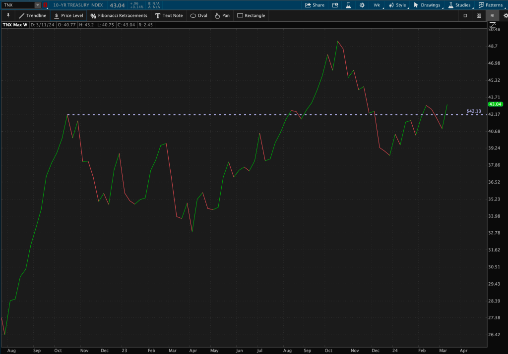
So, you tell me.
Because to me, it looks as though rates have already broken out on a longer-term basis. We just may need a bit longer for the daily trend to catch up.
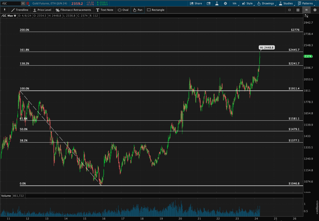
Energy
Using the $XLE (SPDR Energy ETF) as a proxy for the Energy sector, you can see that this week resulted in some major developments for the group.
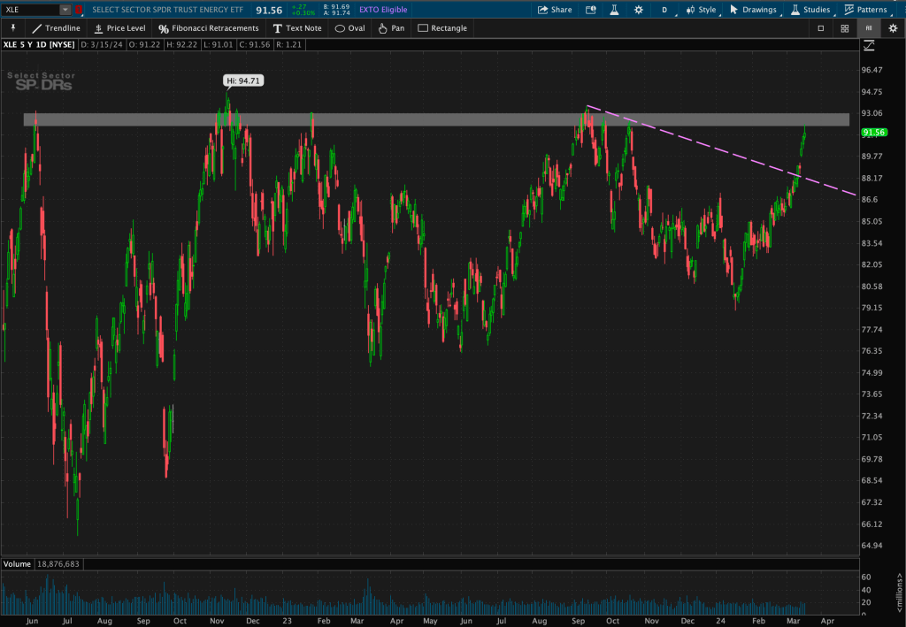
First, on Monday, $XLE broke out from its valid descending trendline resistance level. Afterwards, it rapidly made its way towards its near 2-year long horizontal resistance level.
Zooming out, on the weekly chart, you can see Energy remains above ’08 highs.
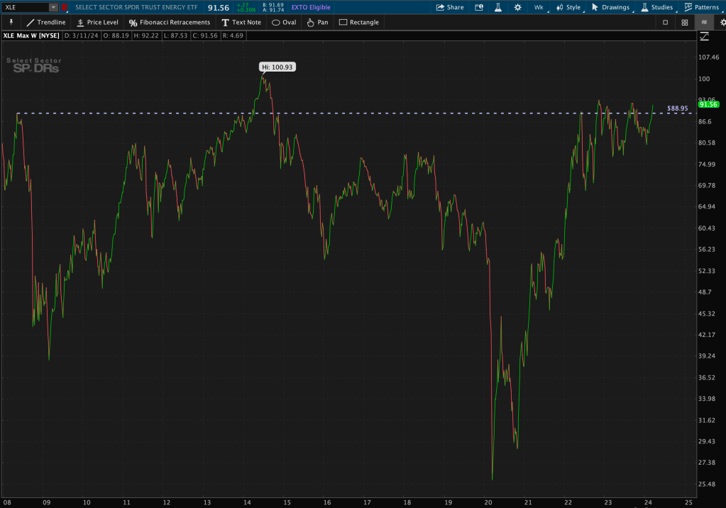
Could Energy be forming a possible pattern at this crucial 16-year long level?!
I shared this chart last month, which appears as though Energy may be forming a bullish continuation pattern on a longer-term, monthly, time frame.

What does this all mean?
It appears as though energy prices and the bond market are pricing in a longer-term inflationary regime. You’ve seen the data over the last 4 years for energy performance versus the rest of the market. We’ve also zoomed out and identified longer-term levels of secular support and resistance.
Both of those trends are occurring simultaneously as yields are inching upward and the technology sector is losing its steam.
Coincidence? Or is the market whispering clues as to what’s to come?
Just make sure you are listening!


Leave a comment