What’s the old saying? The “trend is your friend until it bends?”
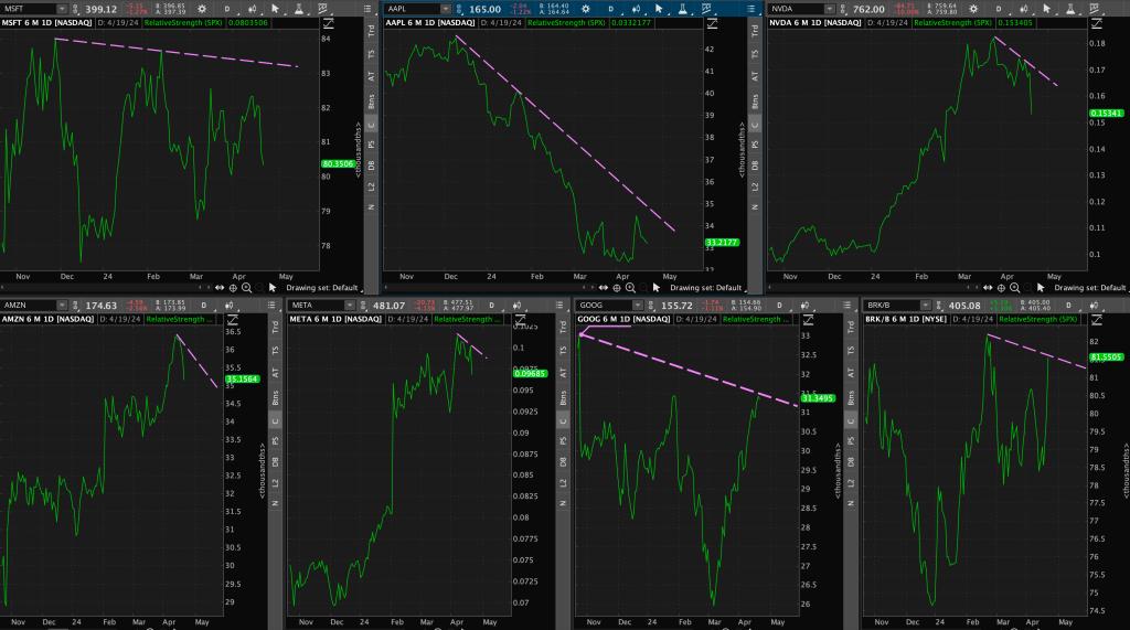
It’s safe to say we are continuing to see major changes in the market, and especially with our market leaders (“Mag 7” stocks).
I won’t even discuss sentiment shifts yet….
Let’s start with a few weekly chart index updates. Then we can move into individual names. We will save the best for last.
Index Analysis
1. S&P 500

Looking at a weekly chart, we can see $SPX (S&P 500) printed a clear High Wave Doji candlestick. These candlestick patterns typically occur amidst a strong trend, and tend to indicate a pause or indecision in the trend. They could also indicate a possible reversal.
Now onto volatility.
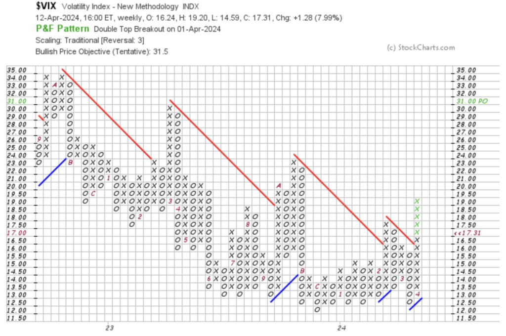
2. VIX Volatility Index
The $VIX (CBOE Market Volatility Index) or the “Fear Factor Index” has been making higher lows and higher highs since mid-December ’23.

Why is this important?
The VIX is an indicator of 30-day implied volatility determined through S&P 500 options activity, but expressed as an annualized figure. It’s a great way to gauge market sentiment, or fear and stress among market participants.
So, for example, a VIX level of 15 means that over the next 30 days, the market is expecting roughly a 4.33% move in the S&P 500 (VIX value / square root of 12).
Now that may not seem like much – and it isn’t. The long-term VIX average is around 20. Therefore, we are still seeing relatively low levels of volatility compared to the past. The point here is that volatility has been trending upwards for over three straight months now.
Next, onto small caps.
3. Russell 2000 Index
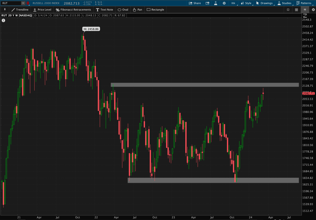
The Russell 2000 Index has been stuck in a 2-year long range and can’t seem to escape. This is not to say that it won’t breakout, but we haven’t seen it yet. It continues to remain under long-term resistance.
What should we discuss next?
The Nasdaq?
4. NASDAQ Composite

Using weekly closing prices (thank you Charles Dow), we can see last week that the Nasdaq made a new all-time weekly high.
Where did it go this week? It drew back for a touch of support – its prior resistance level that it had just broke through.
Will this be a support bounce or is it going to be an ‘Oops’ breakout? We will have to wait and see.
Okay, enough about the indexes. Let’s talk about some of those high-flyer names.
Equities
1. Apple
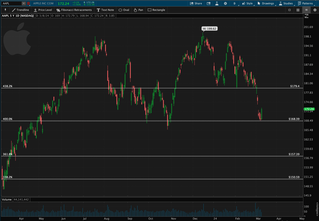
The first leader that caught my attention when cycling through weekly charts this morning was Apple ($AAPL).
I’ve watched it gap down multiple times over the last few weeks after breaking out from its Triangle pattern. You can view more chart posts on X and my latest blog post https://dashcharts.wordpress.com/2024/02/25/mag-7-still-struggling/

A couple of days ago, it reached its downside target price from that pattern. Afterwards, it rested at a level of Fibonacci support (drawn from covid ’20 highs to ’20 lows).
But what happens next?
Zooming out, and analyzing a weekly chart, I see a clear, ‘possible’ pattern forming. Let me warn you, it’s not a great one.
I notice two ‘possible’ peaks, around the same price, and a ‘possible’ neckline around $165. What does this spell?
Double Top.

What is a Double Top? It’s a bearish reversal pattern with two peaks – the “tops” – and a “neckline,” or level of support.
You may ask, so what does this mean? Or, what do we do next?
Well for starters, we wait until the pattern is fully formed – because technically, we cannot formally name the pattern until the price breaks a certain percentage below the ‘possible’ neckline support. Thus, why I keep mentioning the word, “possible.”
But let’s say it does break below $165, how far can it go?
We measure the price movement from the peaks or tops, down to the neckline of the pattern. In this case, that is about a 25%, or $34 move. We then subtract that amount from the neckline price of $165, and that gives us our downside price target of $131.
It’s safe to say that if this is a Double Top pattern, it could get ugly.
Next up?
2. Nvidia
I’ve been following Nvidia ($NVDA) for a LONG time. You can read my many chart posts on X and my latest blog post https://dashcharts.wordpress.com/2024/02/25/mag-7-still-struggling/
A few things happened this week – one of them being that Nvidia now exceeds a 5.2% weighting in the S&P 500.
Secondly, it ALMOST overtook Apple’s market cap and ALMOST swiped the coveted 2nd market leader spot before Friday’s drawdown.
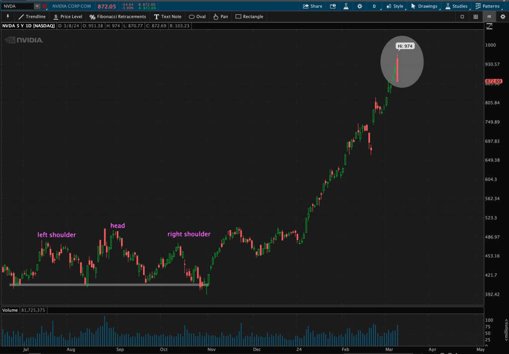
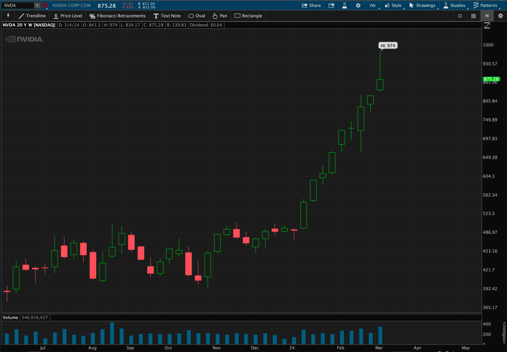
From last Friday’s (March 1st) close, $NVDA gained over 18%, or $151, after gapping up multiple times this week.

$NVDA has also traded up for NINE. STRAIGHT. WEEKS.
But something a little different occurred yesterday… $NVDA printed a Bearish Engulfing candlestick – a bearish reversal pattern.
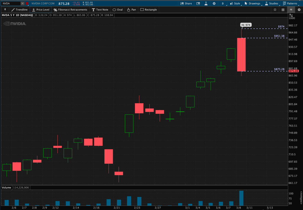
A bearish engulfing pattern is a multi-bar pattern that looks at the current candlestick’s open and close, or “body,” and compares that to the prior candlestick’s body. This one in particular engulfed the two prior days of price action.
Is this finally the top after this “Magnificent” run?
If it is, what action do we take?
Again, we wait. We wait for follow-through. A pattern is not complete until we see follow-through.
If $NVDA continues to make a higher high above $974, that will absolve the pattern. But if it continues to move lower, that is where we would take caution and action.
Onto the last stock…
3. Microsoft
Like $NVDA, Microsoft ($MSFT) has been another market leader that I have been following very closely. You can view more chart posts on X and my latest blog post https://dashcharts.wordpress.com/2024/02/25/mag-7-still-struggling/
This week, $MSFT traded dangerously close to its ‘possible’ neckline support within its ‘possible’ Head & Shoulders pattern.

We will see what this week brings for Microsoft.
Now I am not done yet… So hang in there.
I saved the best for last.
Relative Strength Relationship
I detailed in an older blog post about one of my favorite relative strength relationships to monitor – the relationship between Consumer Discretionary ($XLY) and Consumer Staples ($XLP).
You can read about that specific relationship here: https://dashcharts.wordpress.com/2024/02/18/making-a-call/ and in many of my chart posts on X.
If you are new to relative strength, or ratio analysis, you can read more here: https://dashcharts.wordpress.com/2024/02/18/relative-strength-ratio-analysis
I track this relationship, as well as others, over a series of time frames. As a technician, you can gain quite a bit of information from looking at long-term or primary trends, secondary or intermediate trends, and short-term or minor trends.
What did Charles Dow call it? Tides, waves, and ripples?
Another reason I take this approach is because my investing strategy spans various time frames.
Now let’s dive into what occurred this week between Discretionary and Staples.
The ratio broke down through valid trendline support with this week’s close. You can see here the comparison between the last time this happened, in 2020-2021 vs now in 2023-2024.
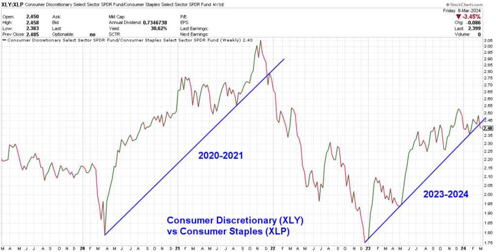
My ears are starting to perk up and my eyes are beginning to widen even more. This relationship is breaking down at the same time we are seeing a broader possible breakdown in the Technology sector – which is the largest sector weighting in the major indexes.
If we are going to continue to see support breaks, trendline breaks, and follow-through of price patterns – all coupled with sentiment extremes and major momentum divergences – I may see a red flag, or quite a few, flying high and wide.
“The trend is your friend, until the end when it bends.”


Leave a comment